Reports & Results
Reading the projection results, printable reports, interactive charts, and CSV export.
- Projection Results — the multi-phase summary
- Data Grid — month-by-month detail
- Interactive Charts
- Printable Report
- CSV Export
- Dashboard
Projection Results — Multi-Phase Summary
After running a scenario, the results page opens with a multi-phase summary bar at the top showing each retirement phase as a tile.
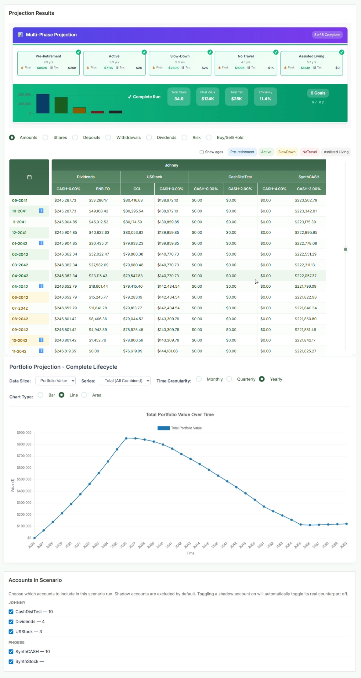
Phase Summary Tiles
Each phase tile shows:
- Duration — how many years and months this phase lasts
- Final: the portfolio value at the end of this phase
- Tax: total estimated taxes paid during this phase
- A green ✓ Funded indicator if the plan has enough money to meet withdrawal targets throughout this phase, or a warning if there is a shortfall
Summary Bar (Complete Run)
Below the phase tiles, the overall run summary shows:
| Metric | What it means |
|---|---|
| Total Years | Duration of the entire plan from today to the end of the planning horizon. |
| Final Value | Portfolio balance at the end of the last phase (the estate value at life expectancy). Not zero means there's an inheritance; zero means the plan is fully consumed. |
| Total Tax | Cumulative estimated taxes paid across the entire plan — RRSP/RRIF withdrawals, employment income, and other taxable events. |
| Efficiency | A rough measure of how efficiently your savings are being deployed — higher means more of your money ends up as spendable income rather than taxes or waste. |
| Goals | Shows goals achieved vs. total goals set (e.g., 3 / 4 goals met). |
Data Grid — Month-by-Month Detail
The data grid shows the value of every account and holding for each month of the projection. Use the phase tabs at the top to navigate to different periods.
View Modes
| View | Shows |
|---|---|
| Amounts | Dollar value of each holding each month. The most common view for reading your projected portfolio values. |
| Shares | Number of units/shares held. Useful for tracking accumulation of units over time. |
| Deposits | How much was deposited into each holding each month during accumulation. |
| Withdrawals | How much was withdrawn from each holding each month in retirement. Useful for seeing the withdrawal order strategy in action. |
| Dividends | Dividend/distribution income generated by each holding each month. |
| Risk | The risk (volatility) score of each holding each month, reflecting allocation shifts over time. |
| Buy/Sell/Hold | Shows which holdings were purchased, sold, or held each month — useful for understanding rebalancing activity. |
Reading the Grid
- Rows highlighted in a different colour indicate a rebalancing month or a significant event (retirement start, RRIF conversion, etc.)
- Column headers show the account name; sub-columns show individual holdings within that account
- The “i” icon on certain months indicates a scenario message (e.g., "RRSP converted to RRIF", "Loan paid off") — hover to read it
- Toggle "Show ages" to display investor ages in the date column instead of calendar months
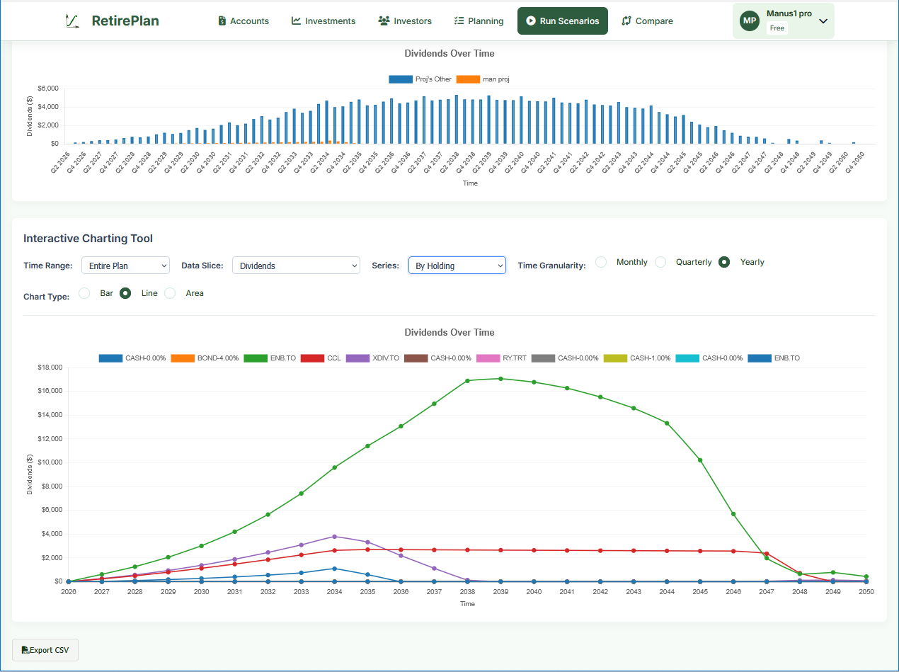
Interactive Charts
Below the data grid, the Portfolio Projection — Complete Lifecycle chart visualizes your plan over time. The controls are powerful:
| Control | Options / Notes |
|---|---|
| Data Slice | Portfolio Value, Dividends, Deposits, Withdrawals, Taxes, Risk — select what you want to see plotted over time. |
| Series | Total (all combined), By Account, By Holding, By Investor — break down who or what is driving the numbers. |
| Time Range | Entire plan, Pre-retirement only, Retirement only, or a specific phase. |
| Time Granularity | Monthly, Quarterly, or Yearly. Yearly is easiest to read for a 30-year plan; monthly for short-term detail. |
| Chart Type | Bar, Line, or Area. Area charts are great for showing stacked totals. |
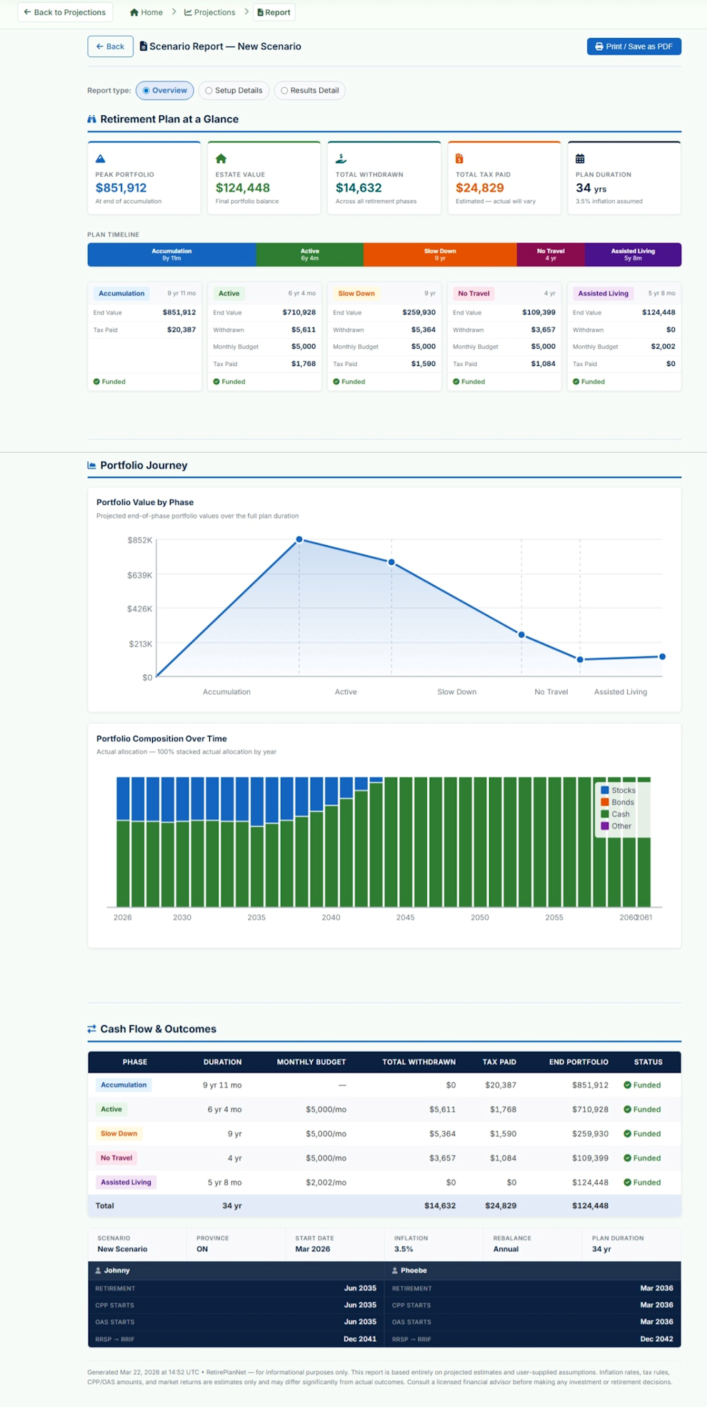
Printable Report
Click the Report button (in the scenario toolbar) to open a print-ready PDF report. Three report types are available:
| Report Type | Contents |
|---|---|
| Overview |
"Retirement Plan at a Glance" — the high-level summary designed for sharing with an advisor or family member. Contains:
|
| Setup Details | Documents all configuration inputs: investor profiles, CPP/OAS, life stages, account list, and scenario settings. Useful as a record of your plan assumptions. |
| Results Detail | Full month-by-month data grid for each phase, including all holdings. This is the most detailed report and will be many pages for a 30-year plan. Best used for detailed analysis rather than quick review. |
CSV Export
Click Export CSV at the bottom of the interactive charts section to download the full projection data as a spreadsheet-ready CSV file.
The exported file contains one row per month per holding, with columns for:
- Date, Phase, Investor, Account, Vehicle/Symbol
- Holdings value, share count, deposits, withdrawals, dividends
- Risk score, buy/sell/hold flag
- Tax amounts for that month
Dashboard
Path: Home (after login)
The Dashboard gives a live snapshot of your current portfolio (today's values, not projected):
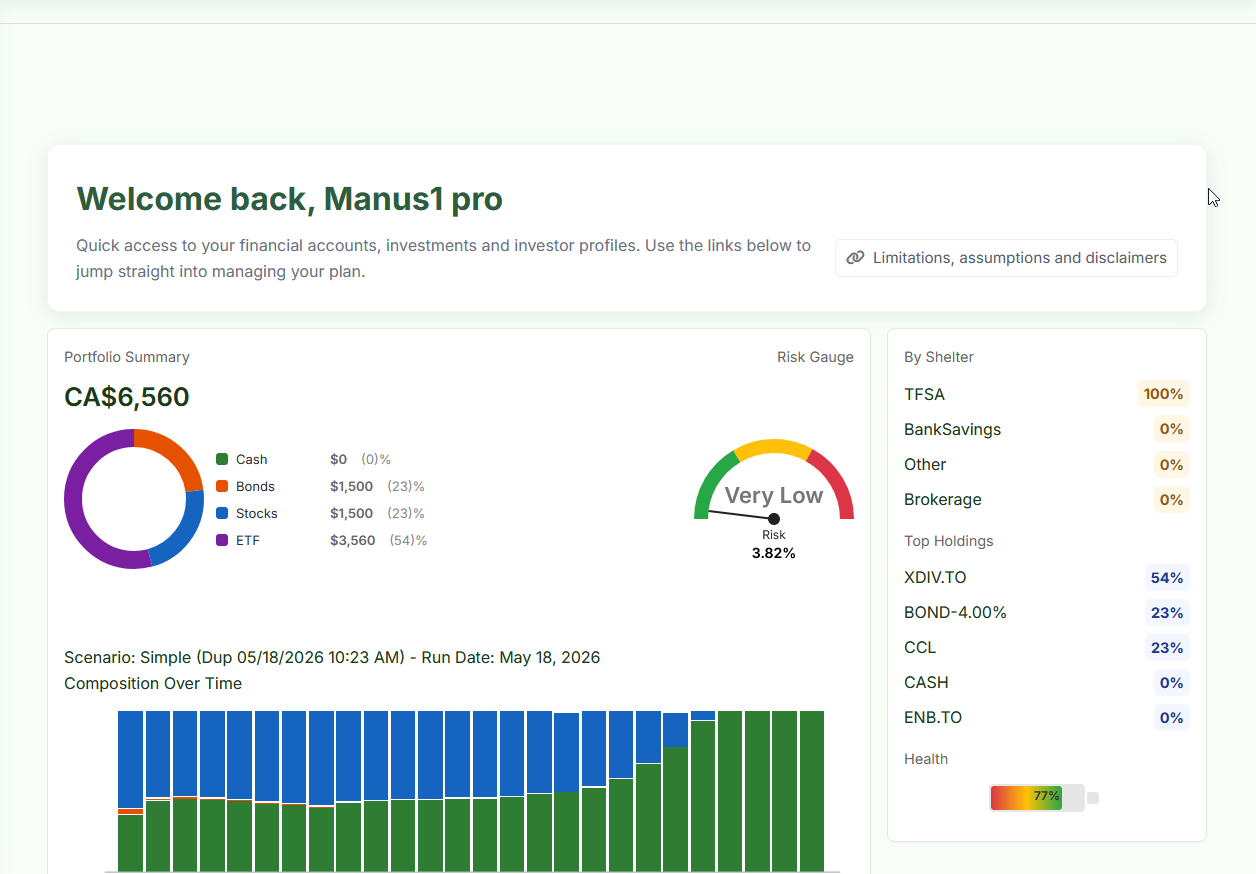
| Widget | What it shows |
|---|---|
| Portfolio Summary | Total current value of all holdings. The donut chart shows current allocation: Cash, Bonds, Stocks, ETF. This is today's actual allocation, not the projected one. |
| Risk Gauge | Current portfolio risk level (1–10 scale). Calculated from your current holdings' asset classes and compositions. Displayed as: Very Low, Low, Medium, High, Very High. |
| By Shelter | Portfolio breakdown by account type (TFSA, Non-Registered, etc.) as a percentage of total. |
| Top Holdings | Your largest holdings by portfolio weight. |
| Health | A readiness score (0–100%) reflecting how well configured your plan is — accounts, holdings, scenario, and most recent projection run. Think of it as a setup checklist indicator. |
| Composition Over Time | Stacked bar chart from your most recently run scenario, showing how your portfolio composition shifts from stocks to bonds/cash over the projection period. |